Archéobjet - A flexible visual identity
Diploma project
My diploma project in Visual Communication at HEAD-Genève, was a collaboration with the Roman Museum of Nyon in Switzerland about its visual identity....
Like many museums today, this museum is presenting its collections and knowledge in an increasingly lively way: interactive digital exhibition, third-place, nomadic museum in the city with a caravan, role-playing games, conferences-brunch, village feast, festival, etc. The discovery of the life of the Romans is becoming more and more lively and playful !
To match their new activities and on the basis of exchanges with the curators, reception managers and mediators, I created Archéobjet.
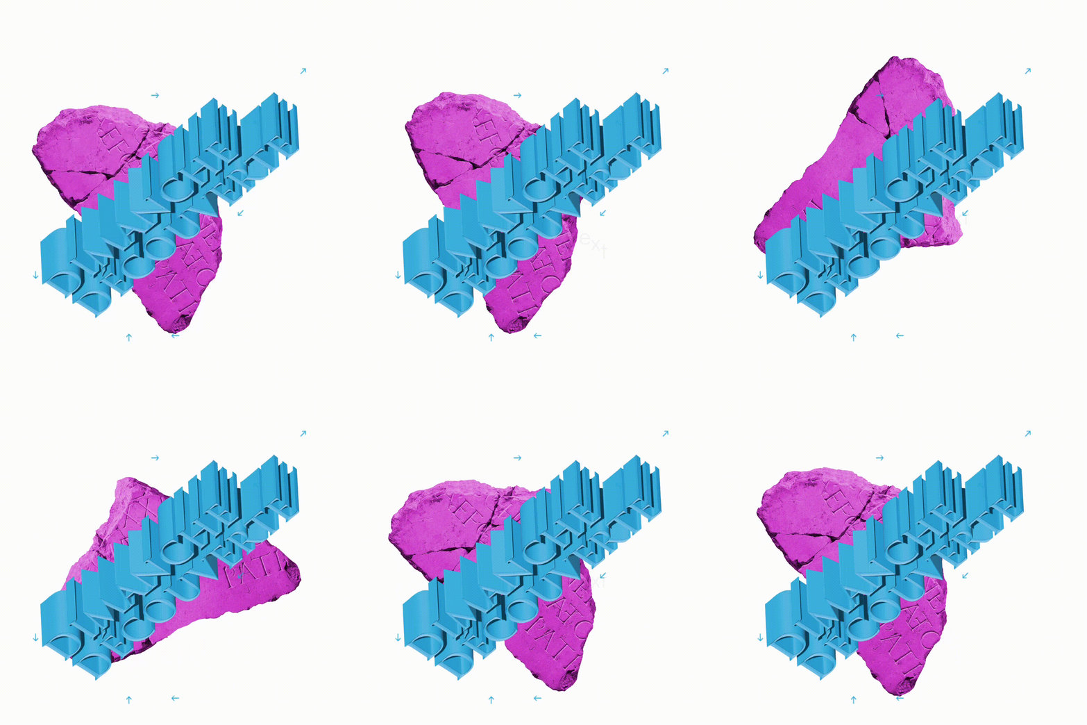
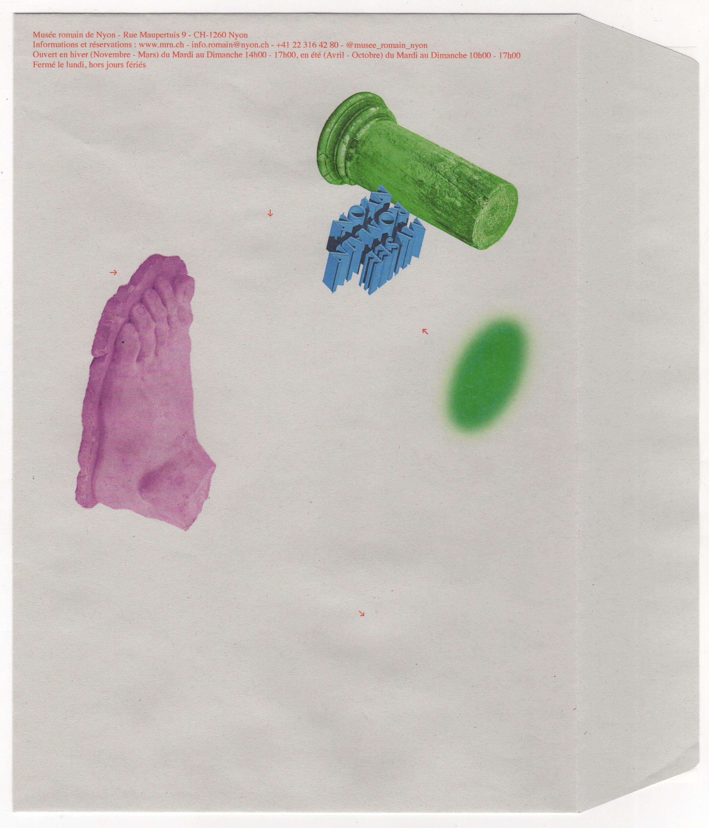
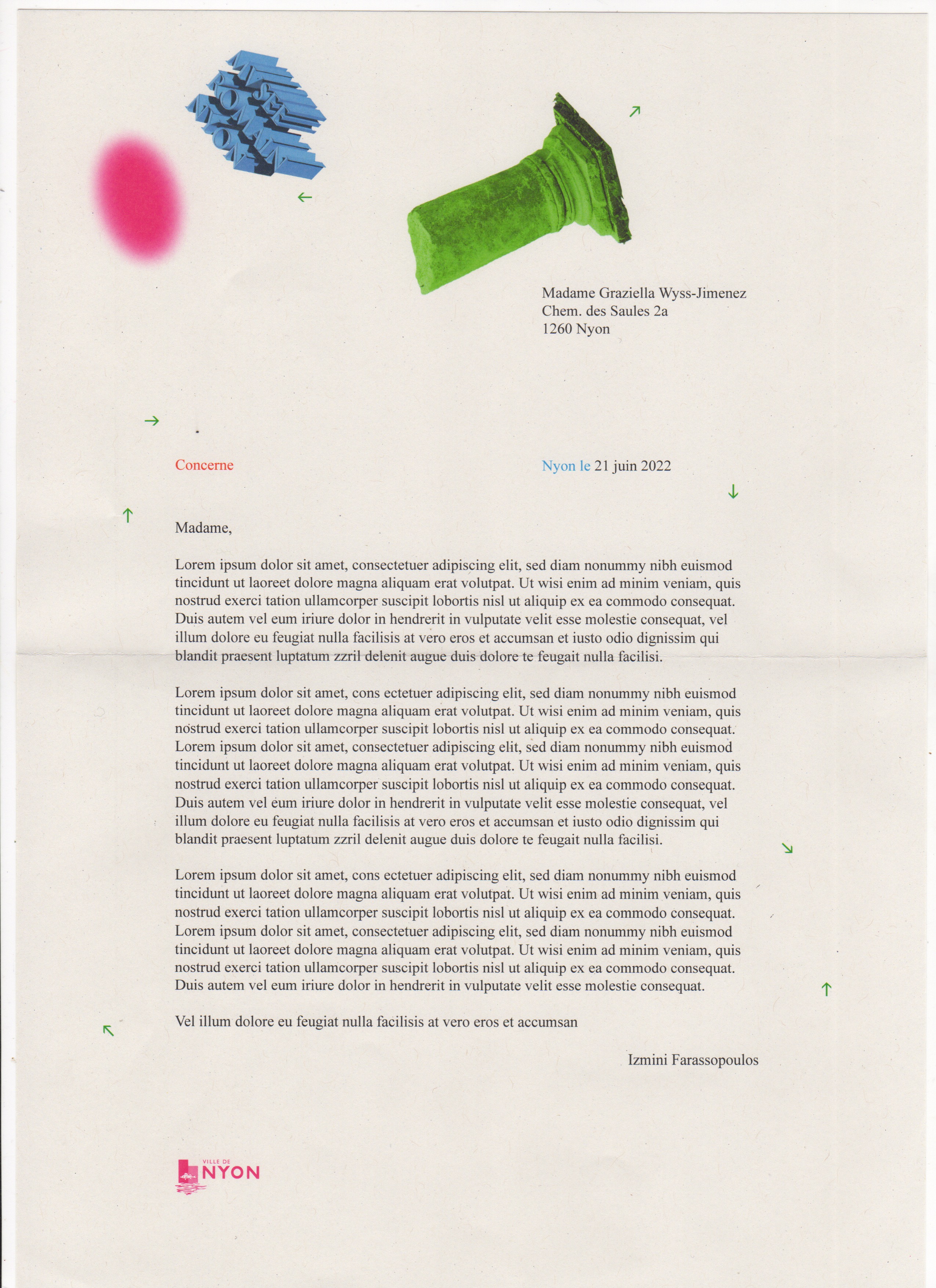
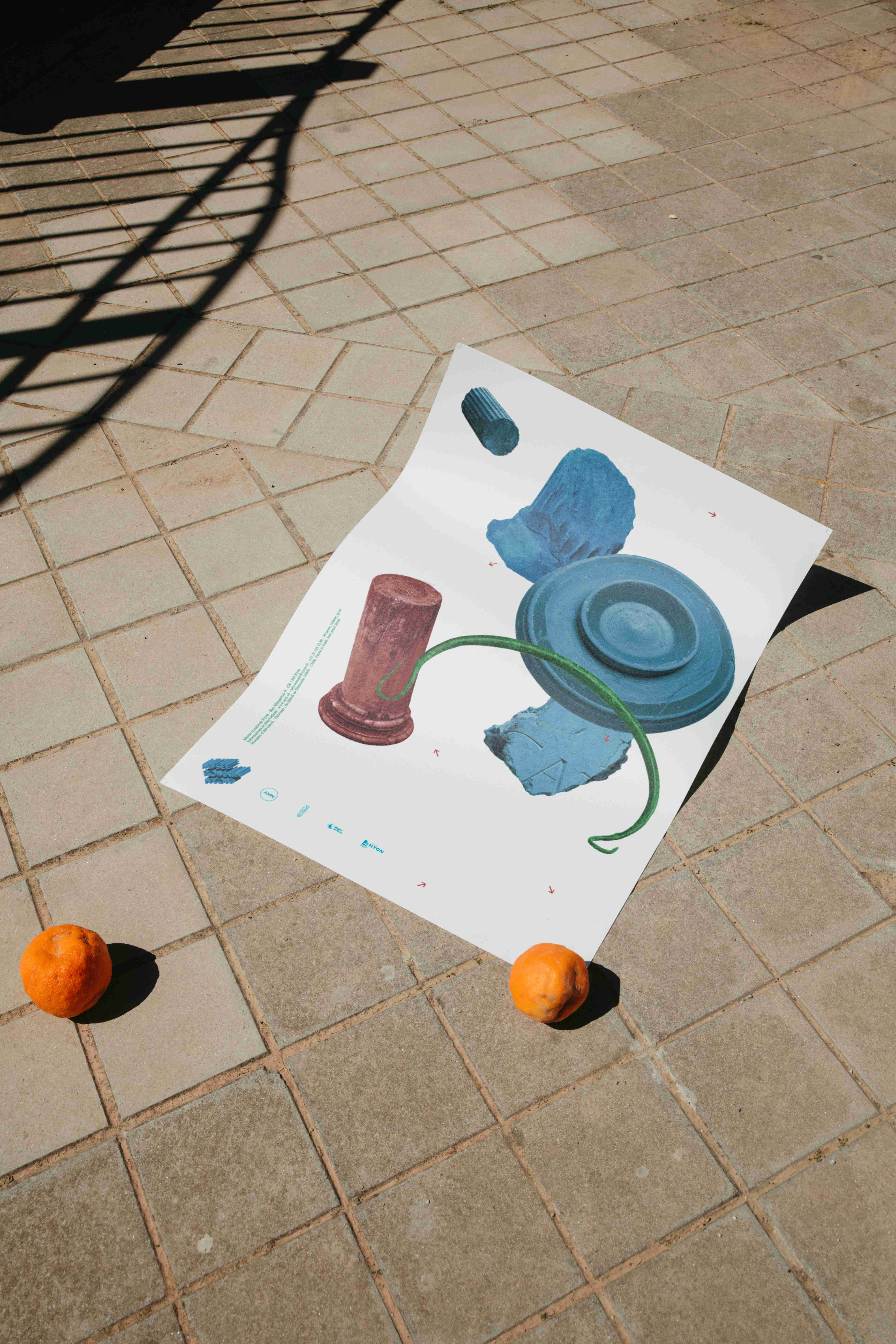
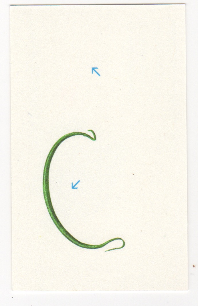
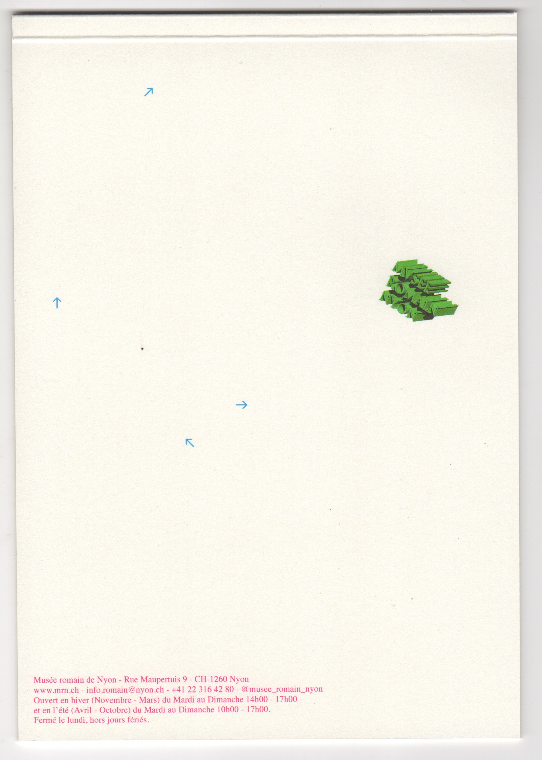
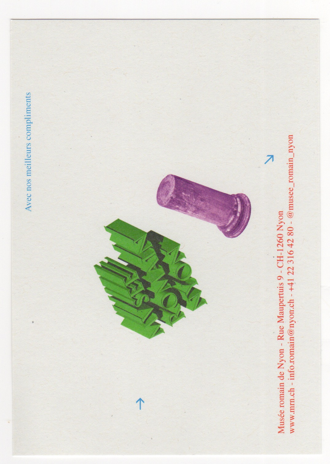
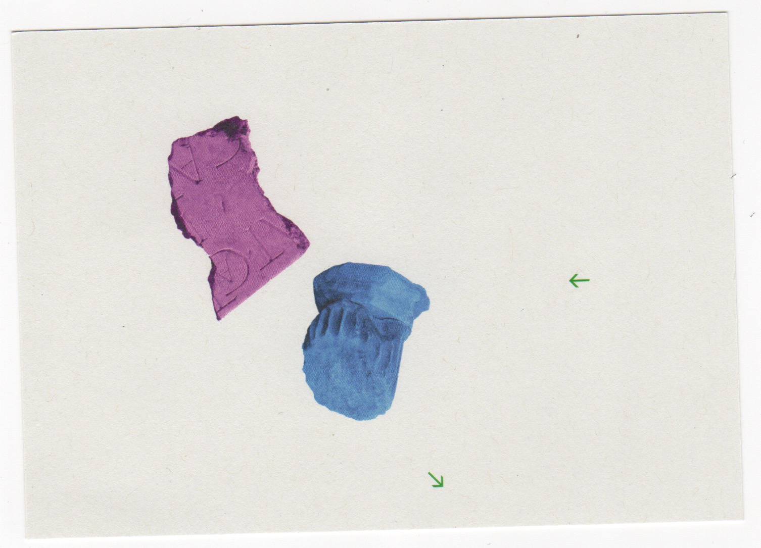
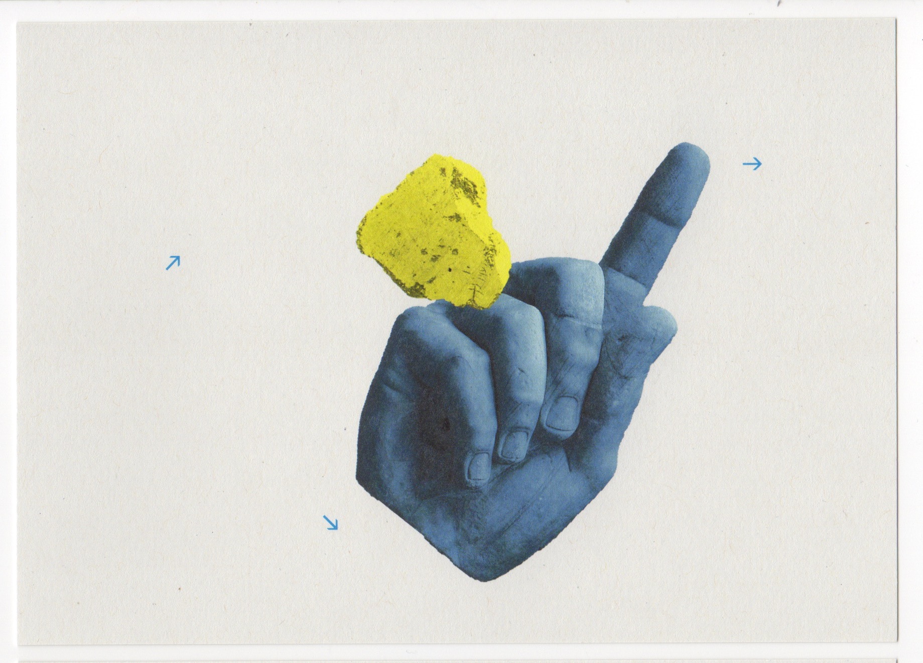
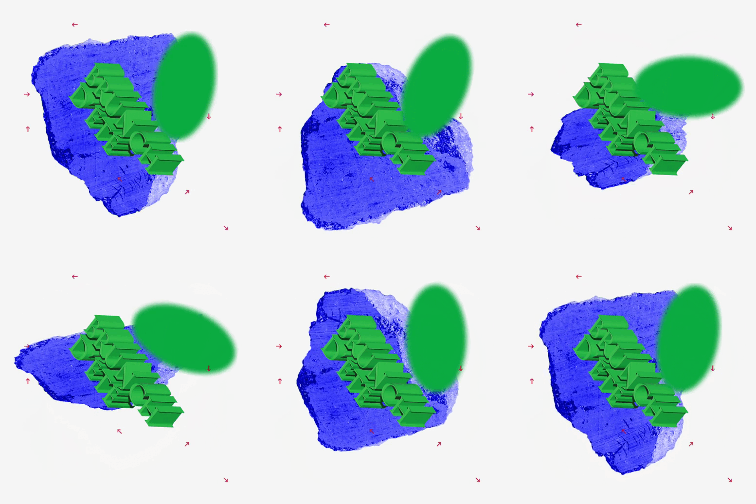
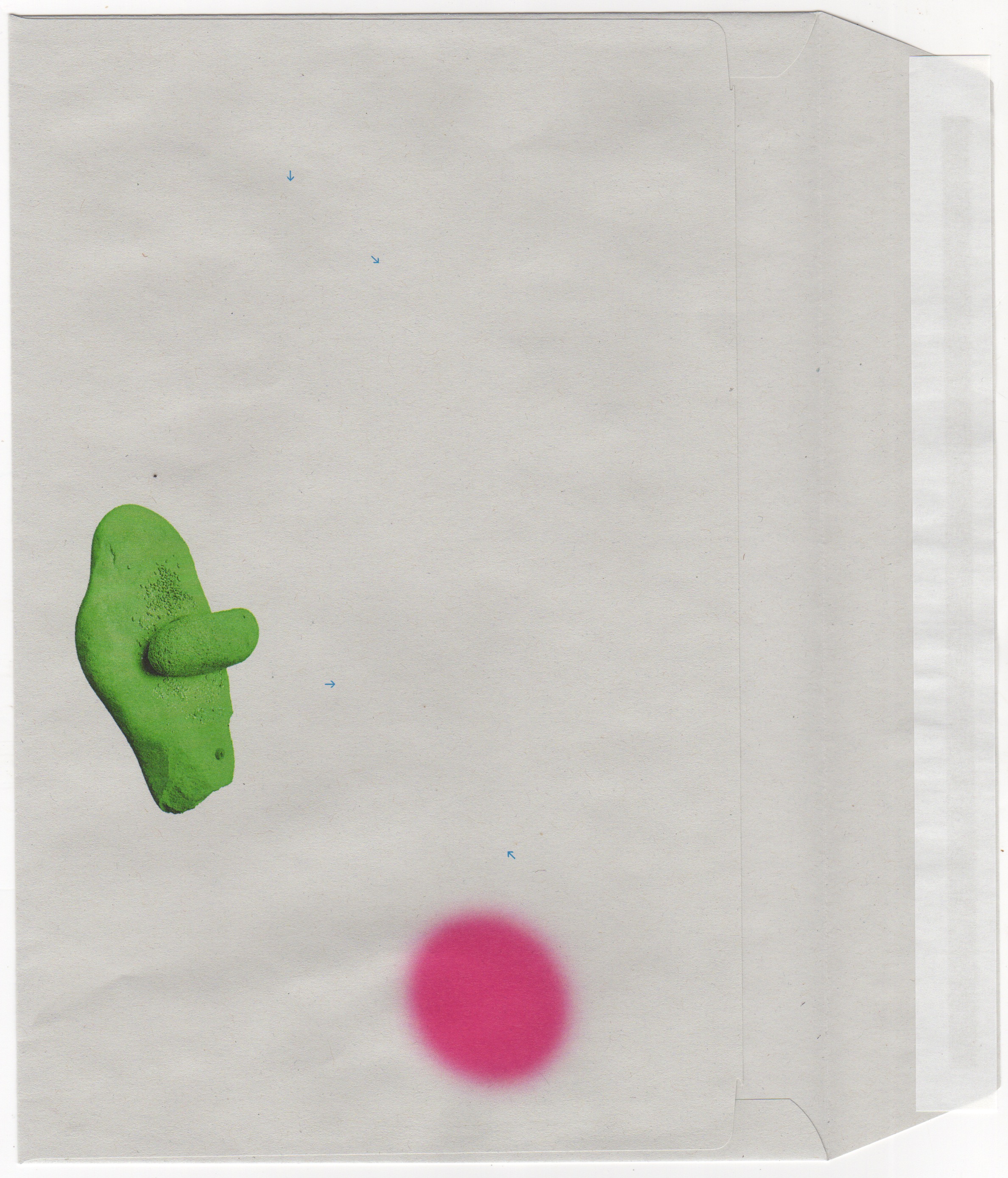
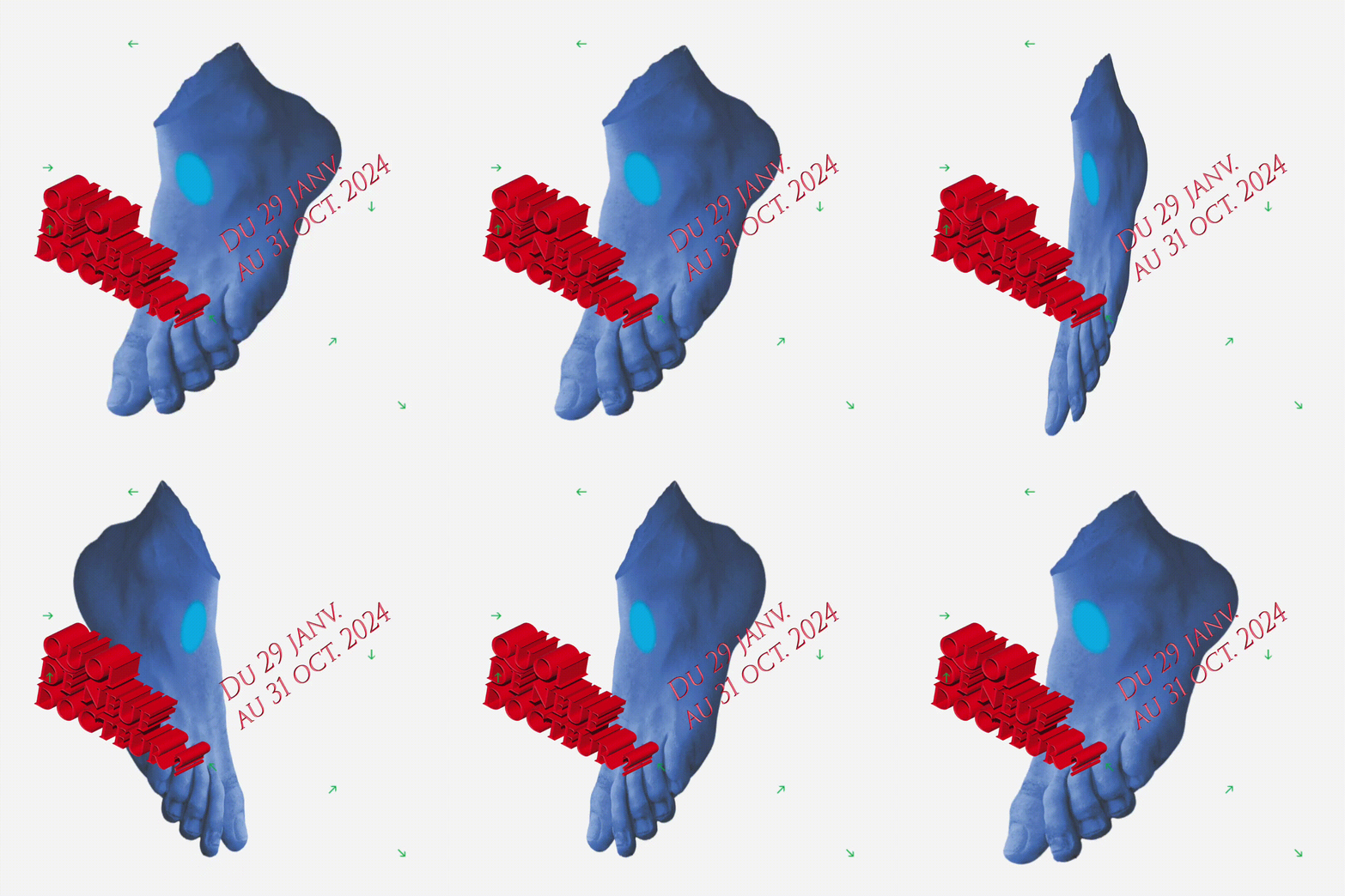
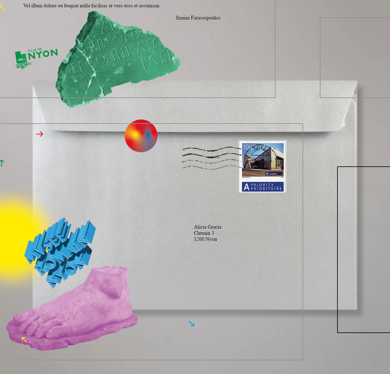
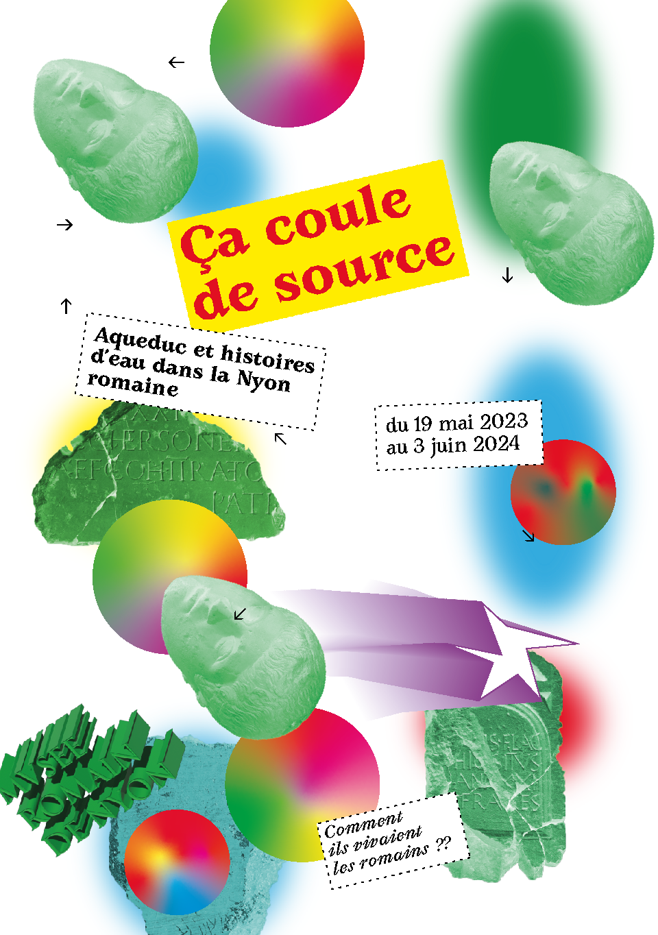
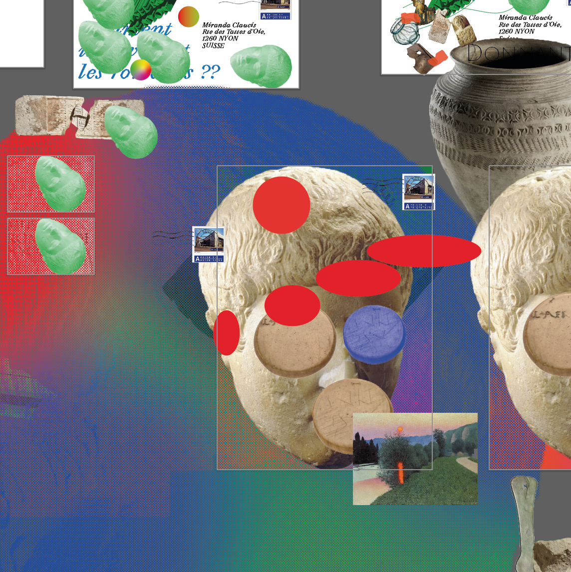
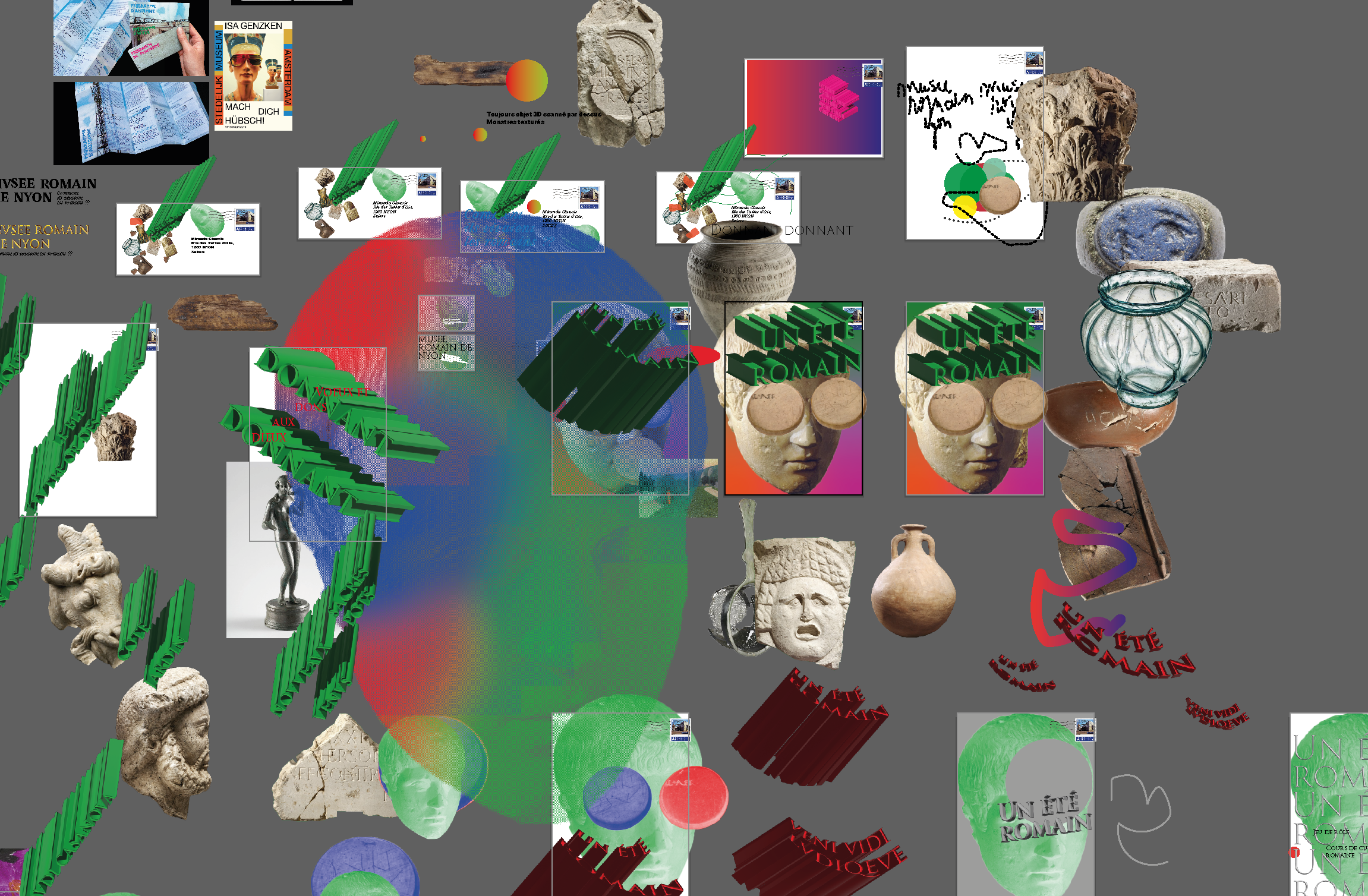
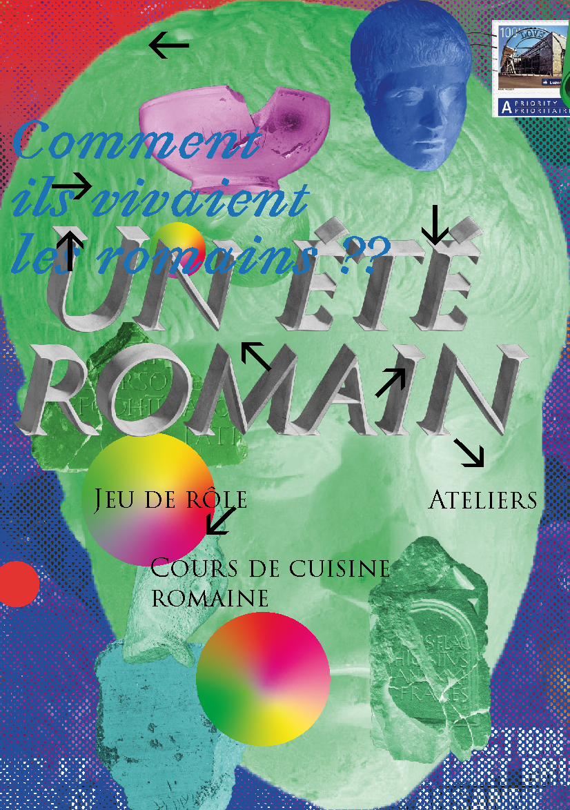
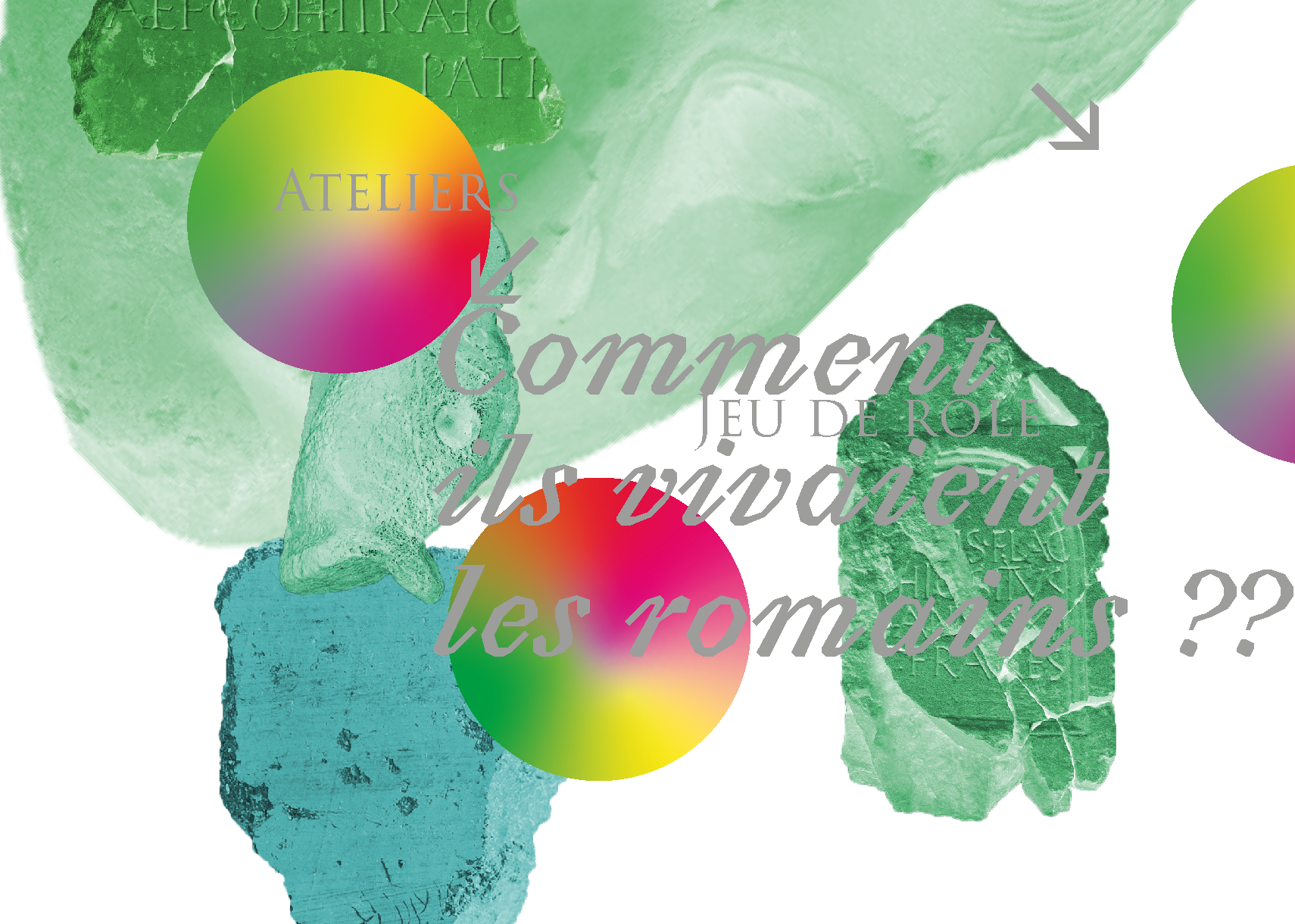
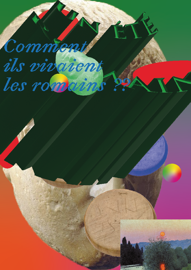
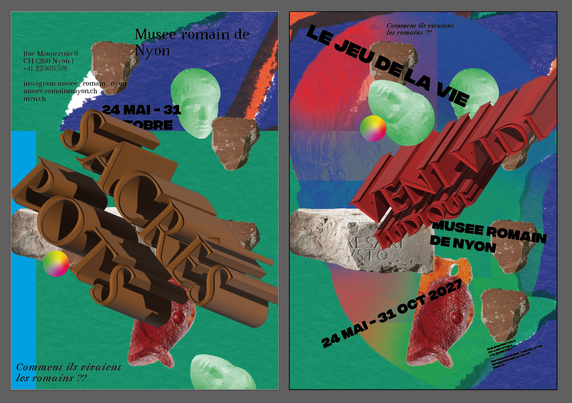
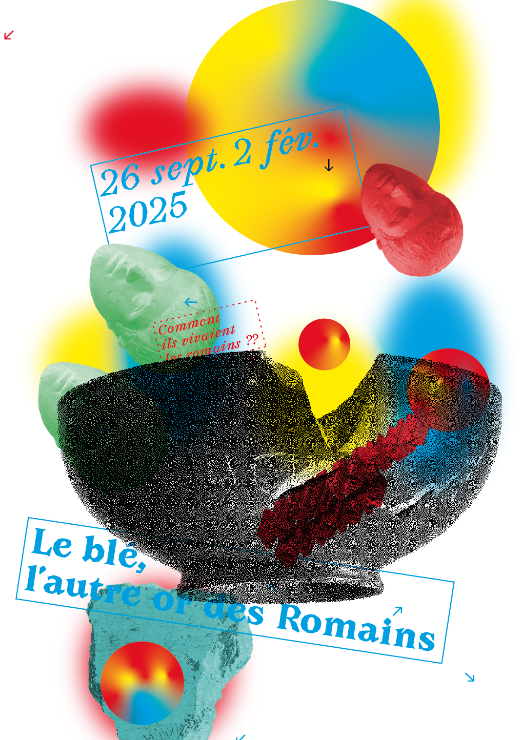
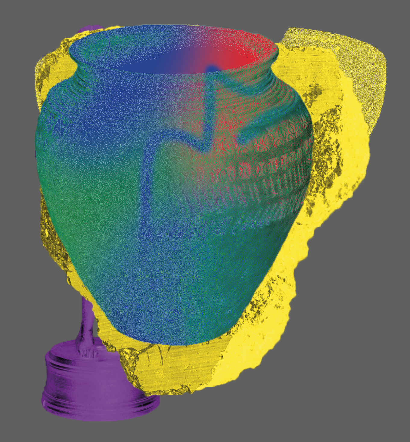
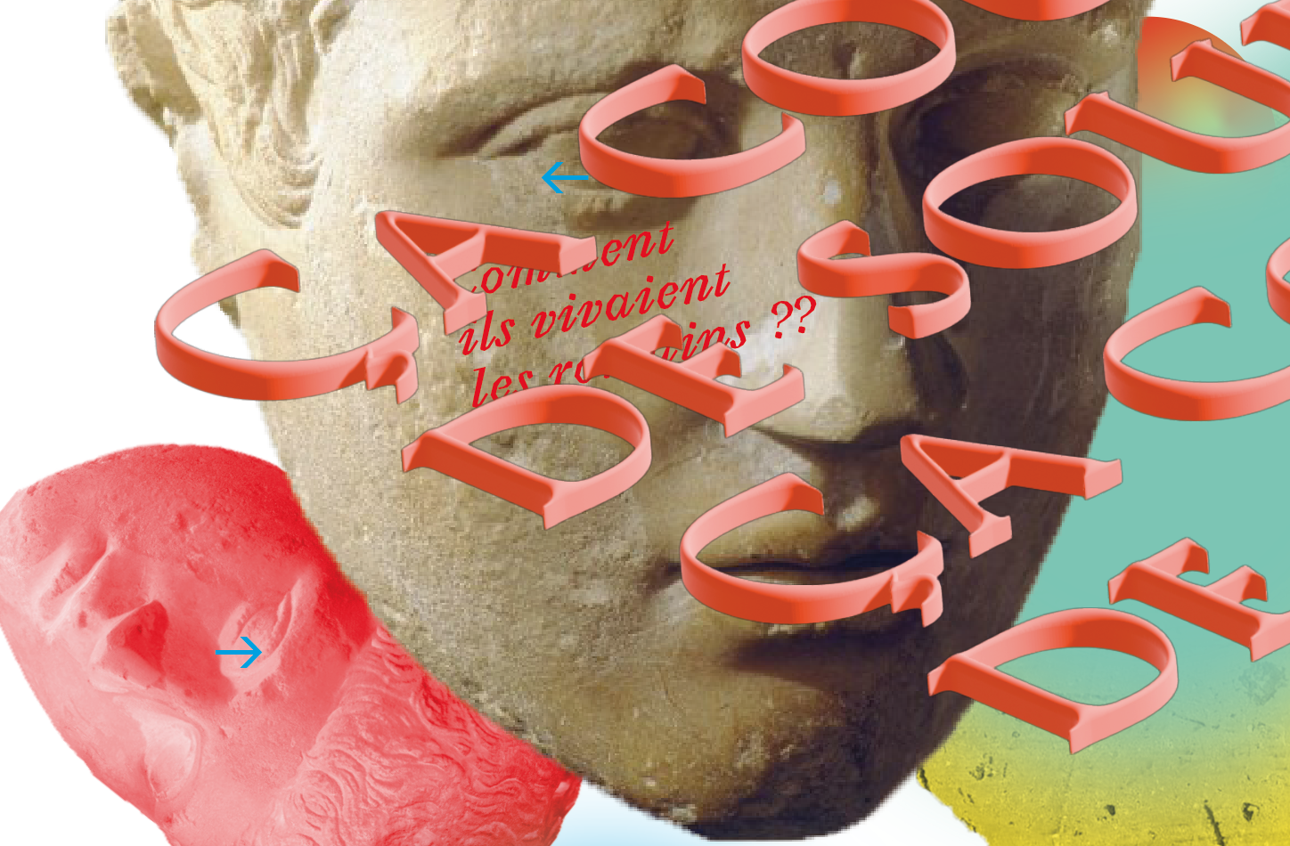
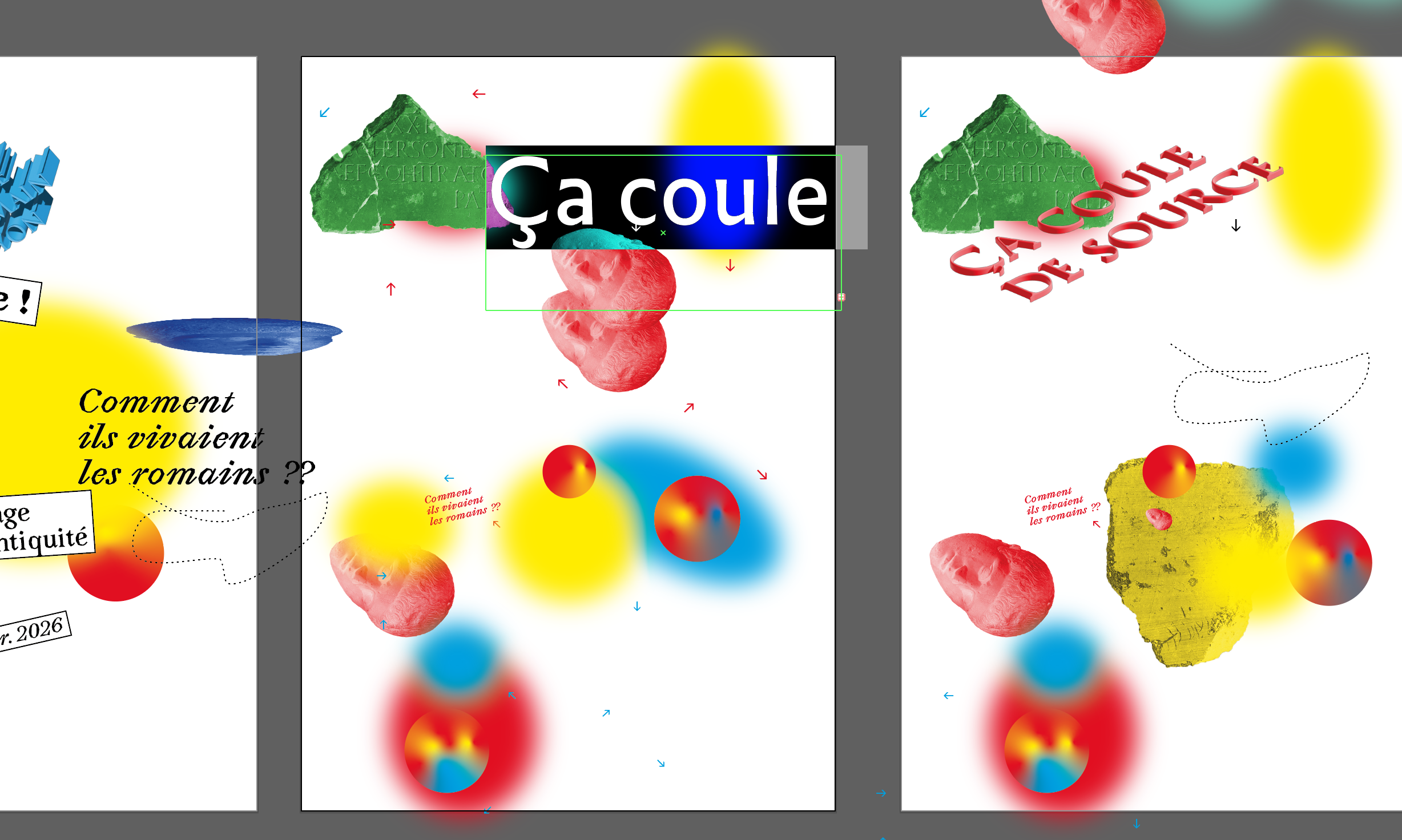
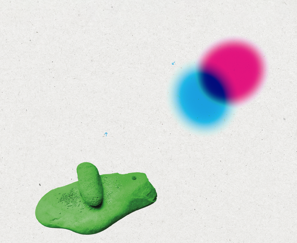
Archéobjet is a graphic toolbox for buildin playful visual messages. When the museum speaks, it does not sacralise the ancient artefacts, but makes them accessible and curious. They are no longer paralyzed in their display cases, but can be manipulated in a timeless space. You can shake them, associate them with each other in your mind as well as on the page. You can imagine how they were used, moved, activated without hindrance by having fun turning them over in all directions. Those who read the museum's messages encounter them here and there, walking alongside the information and texts.
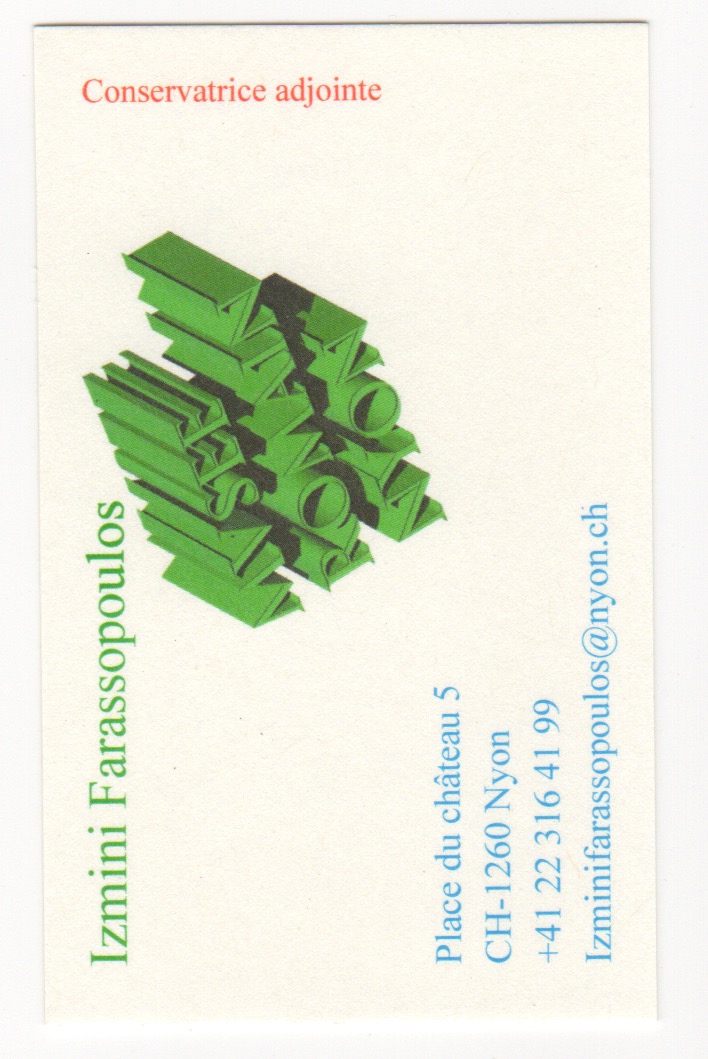
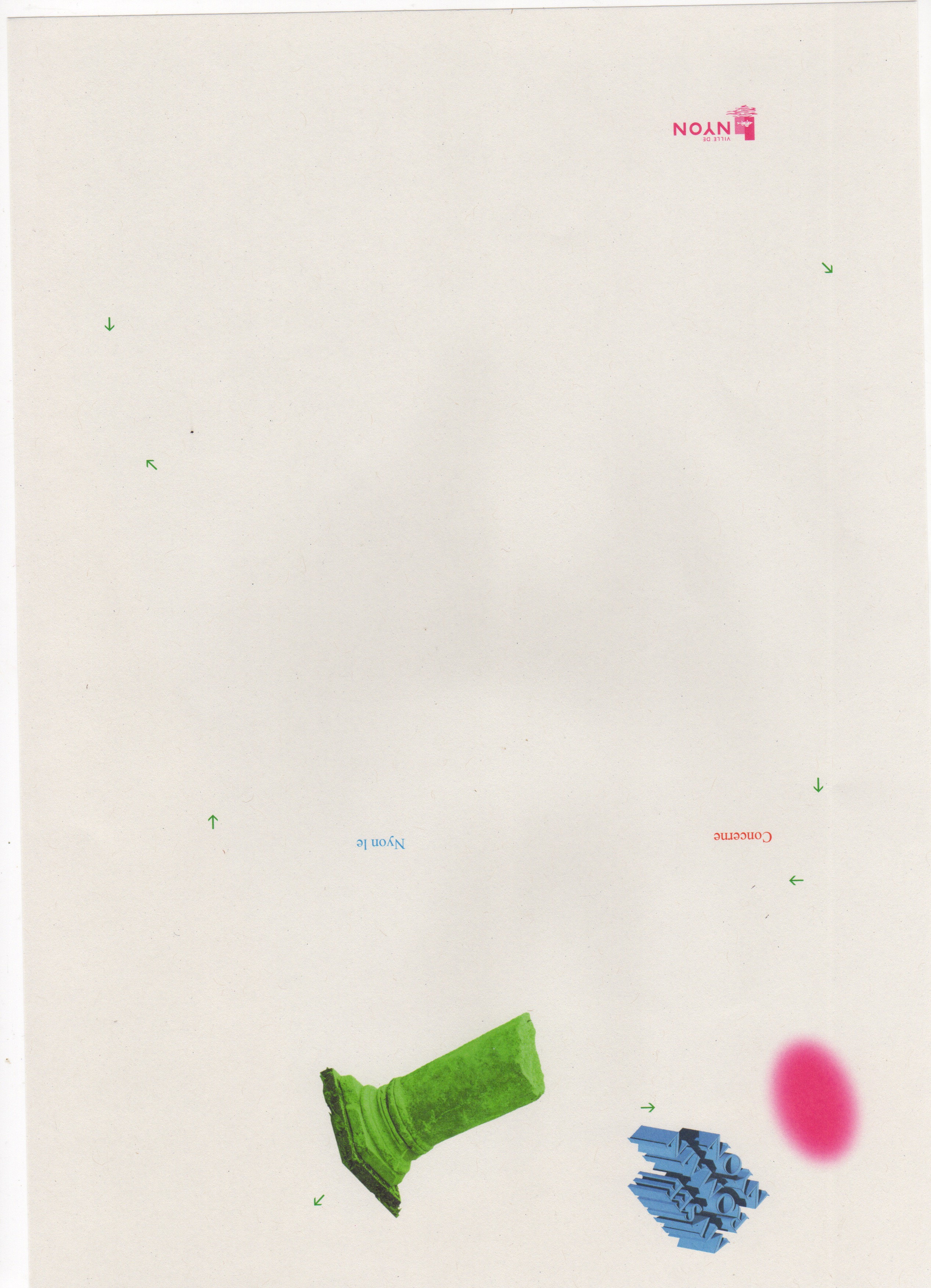
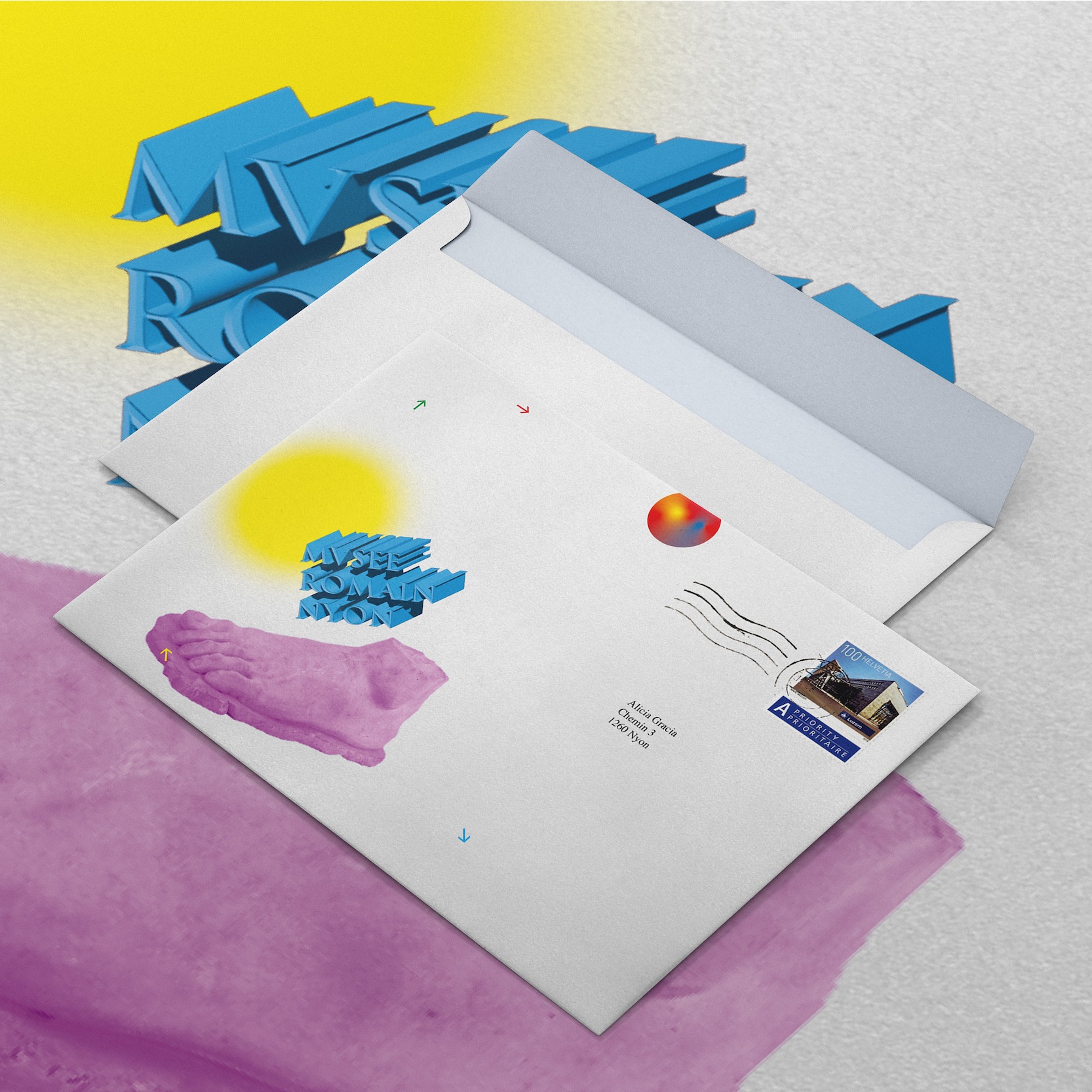
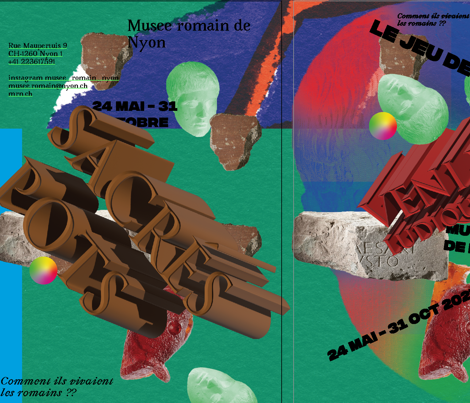
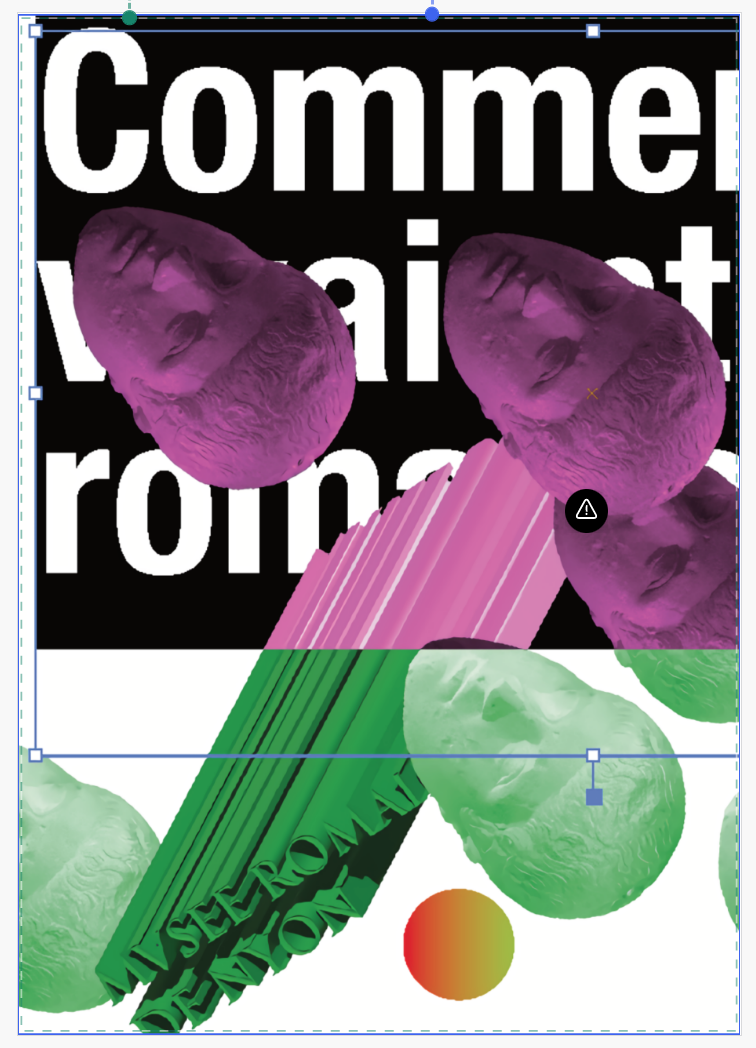
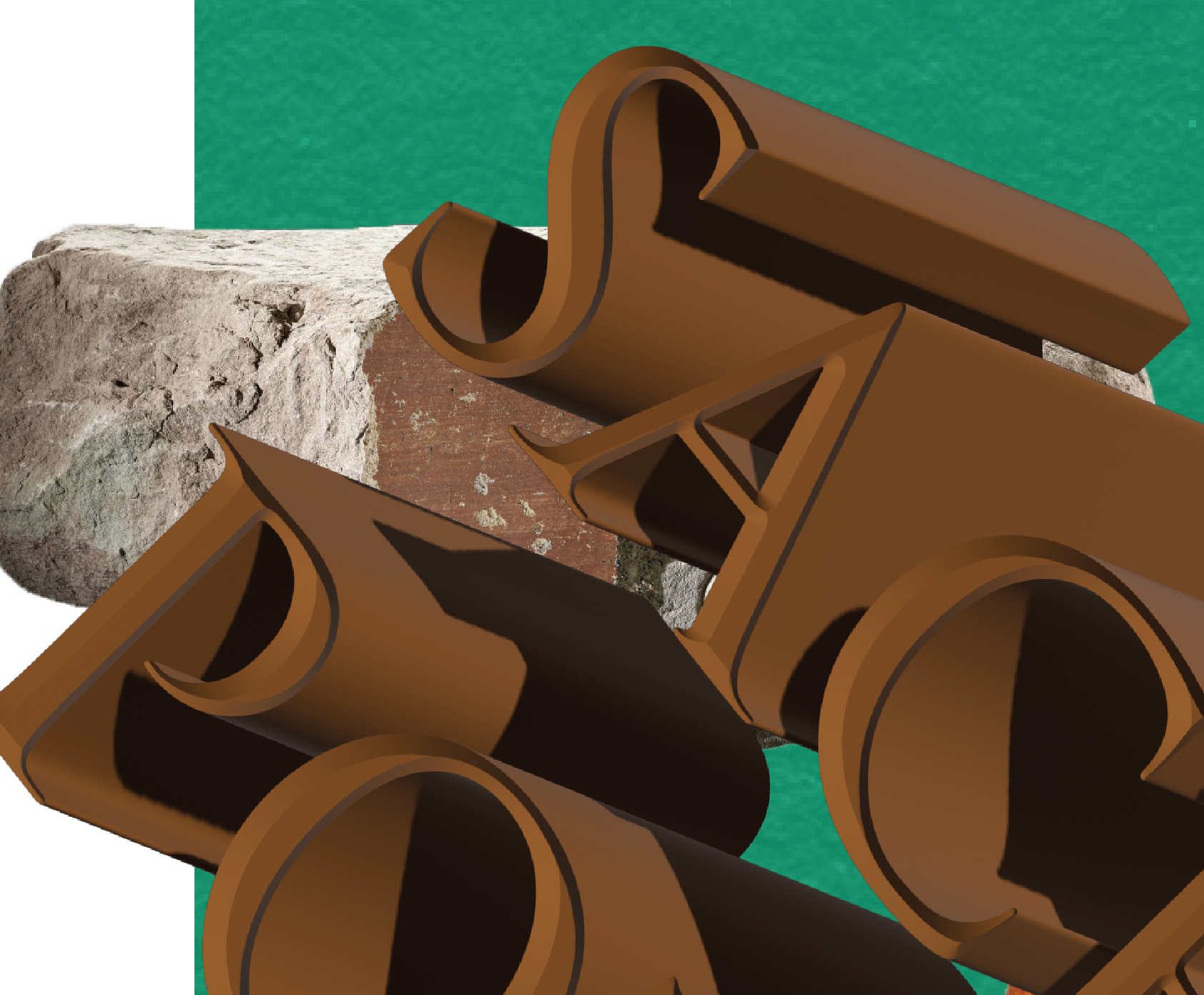
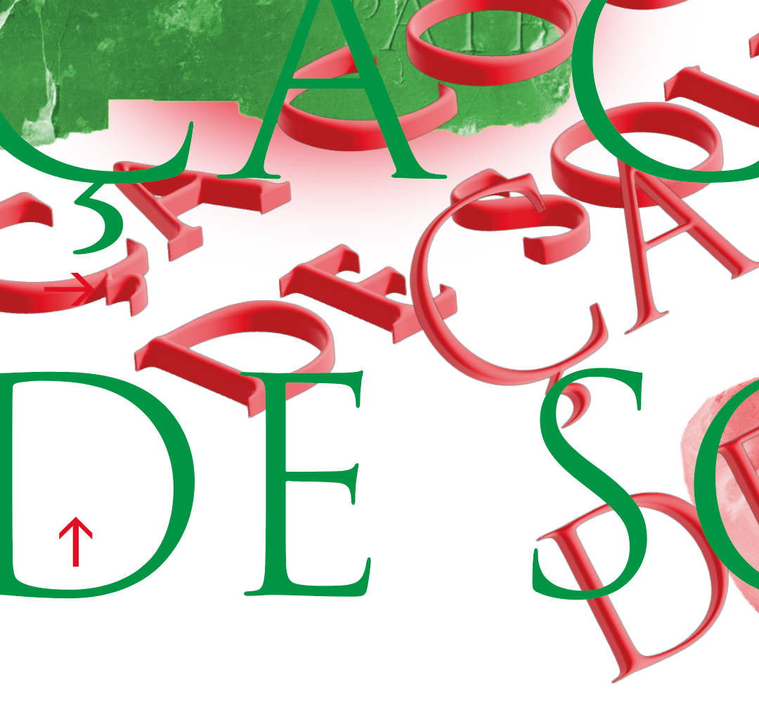
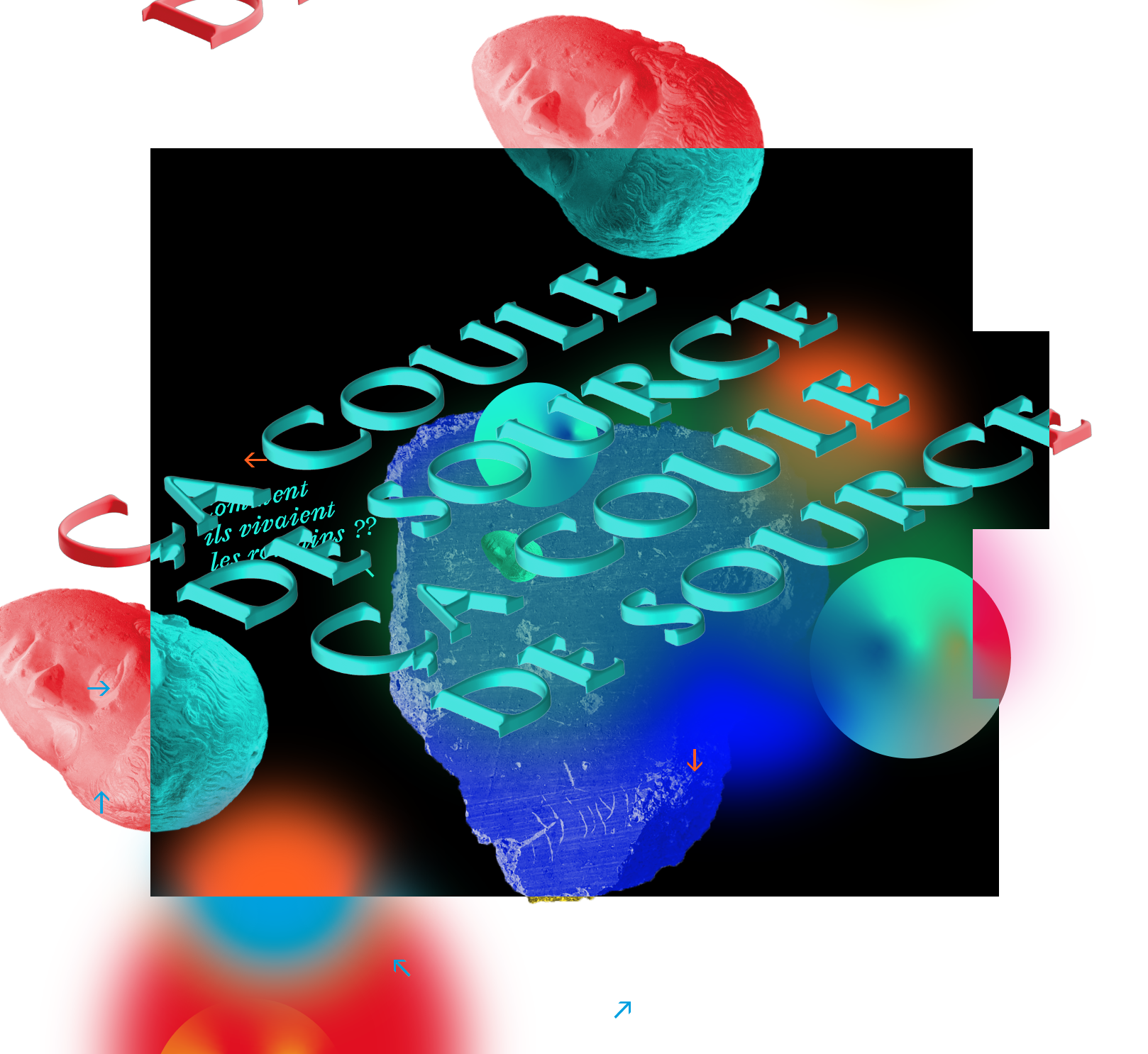
The texts themselves are made tangible and given three dimensions. The titles and the logo, for example, feature the extruded Trajan typeface. It is also recessed into the form, like the Roman lapidary inscriptions. This graphical treatment slightly disturbs these precious artefacts to show them in a new, intriguing and joyful light.
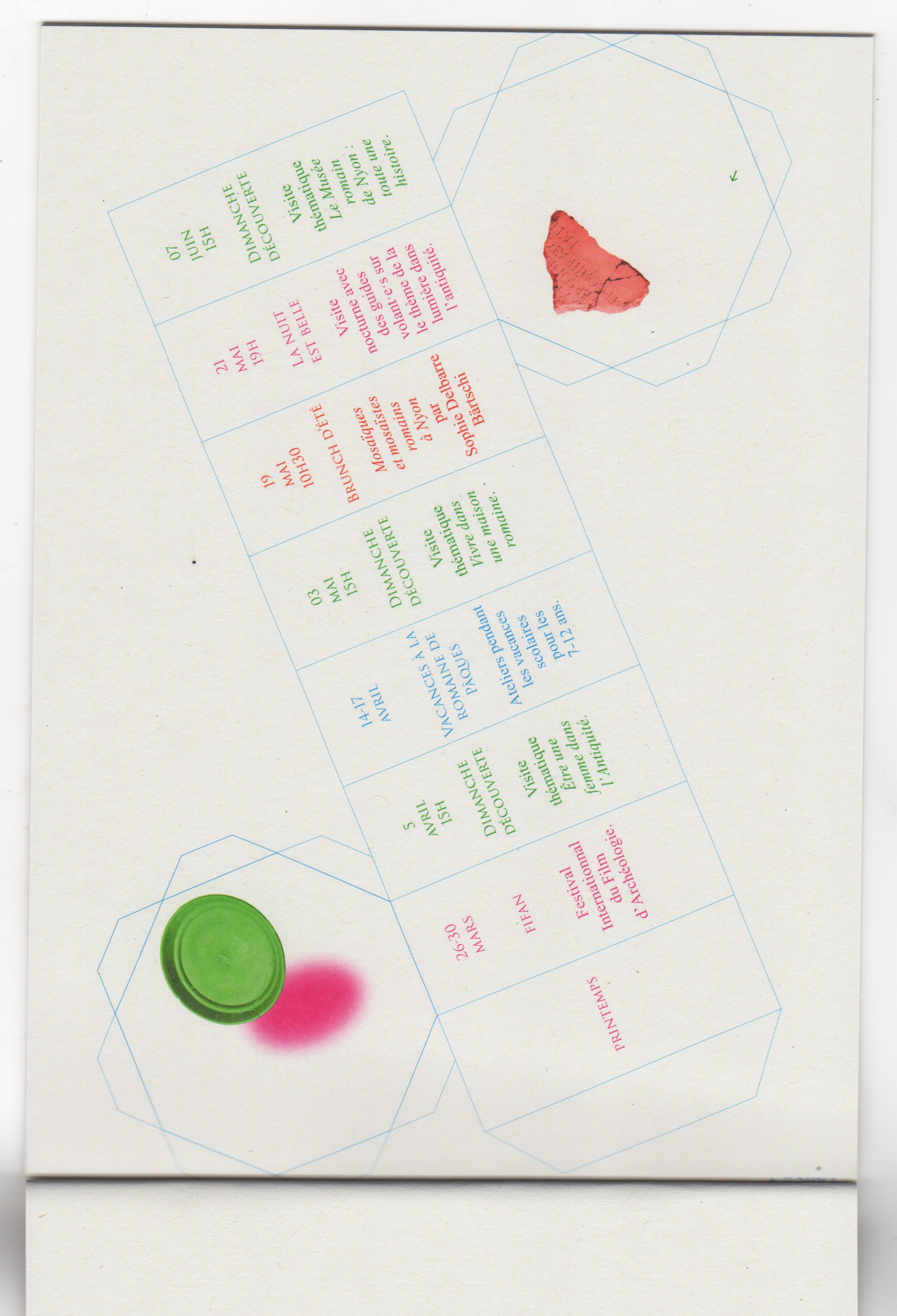
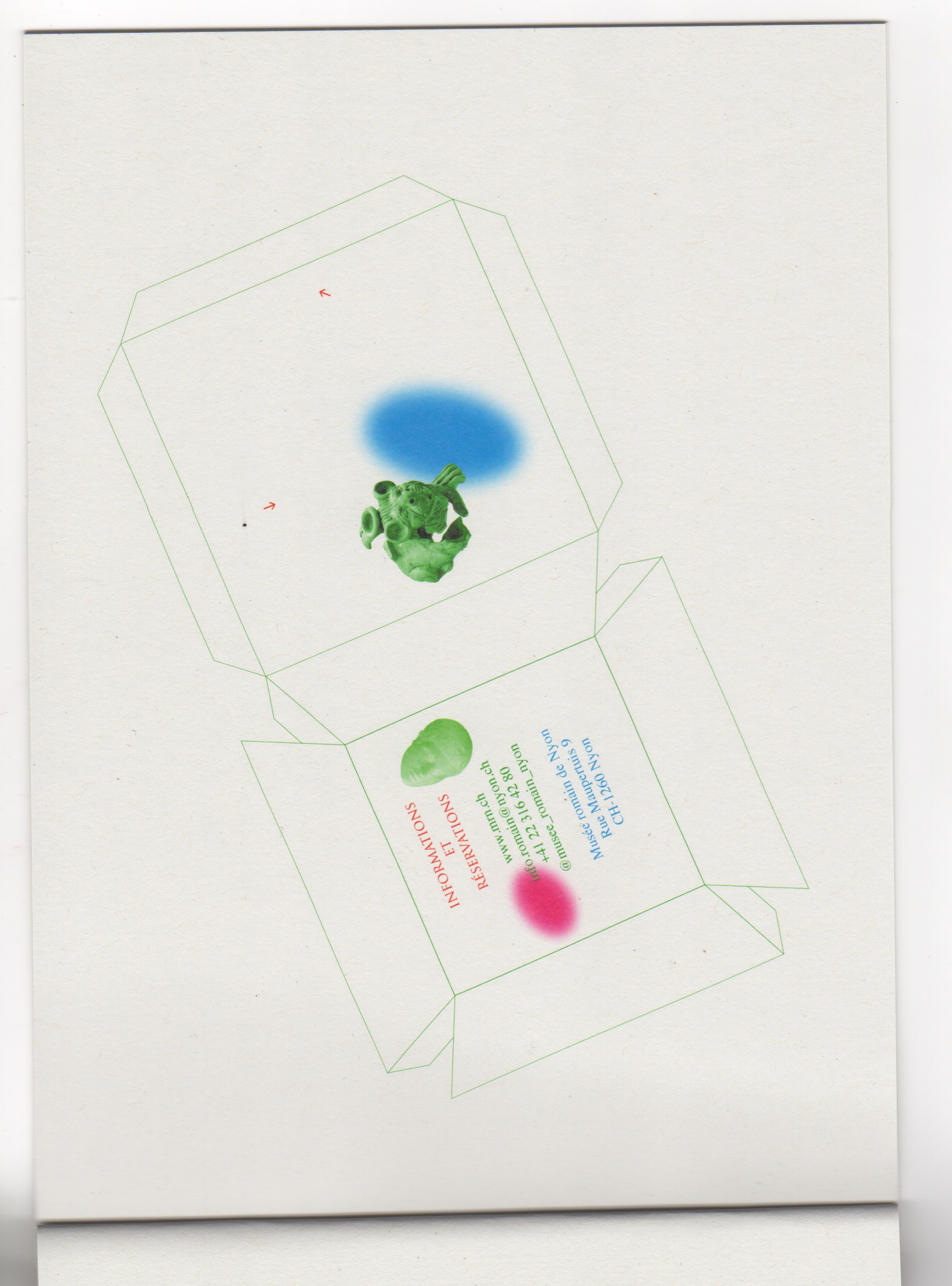
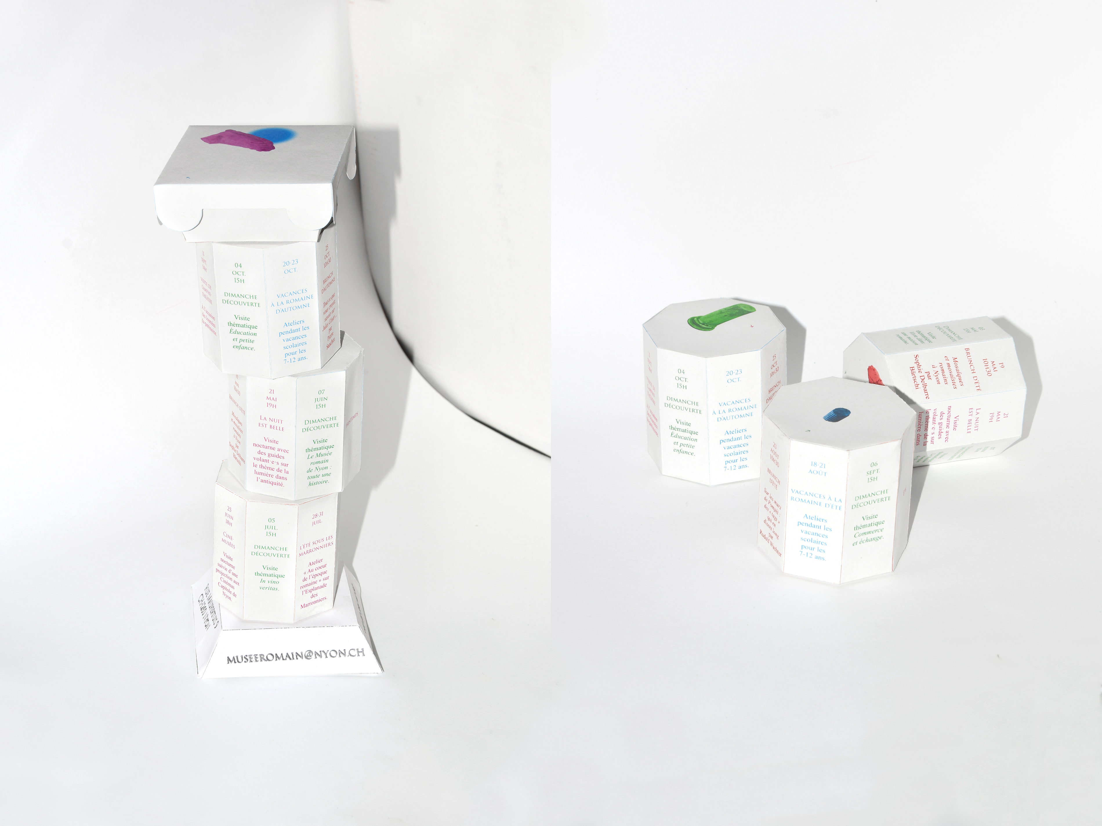
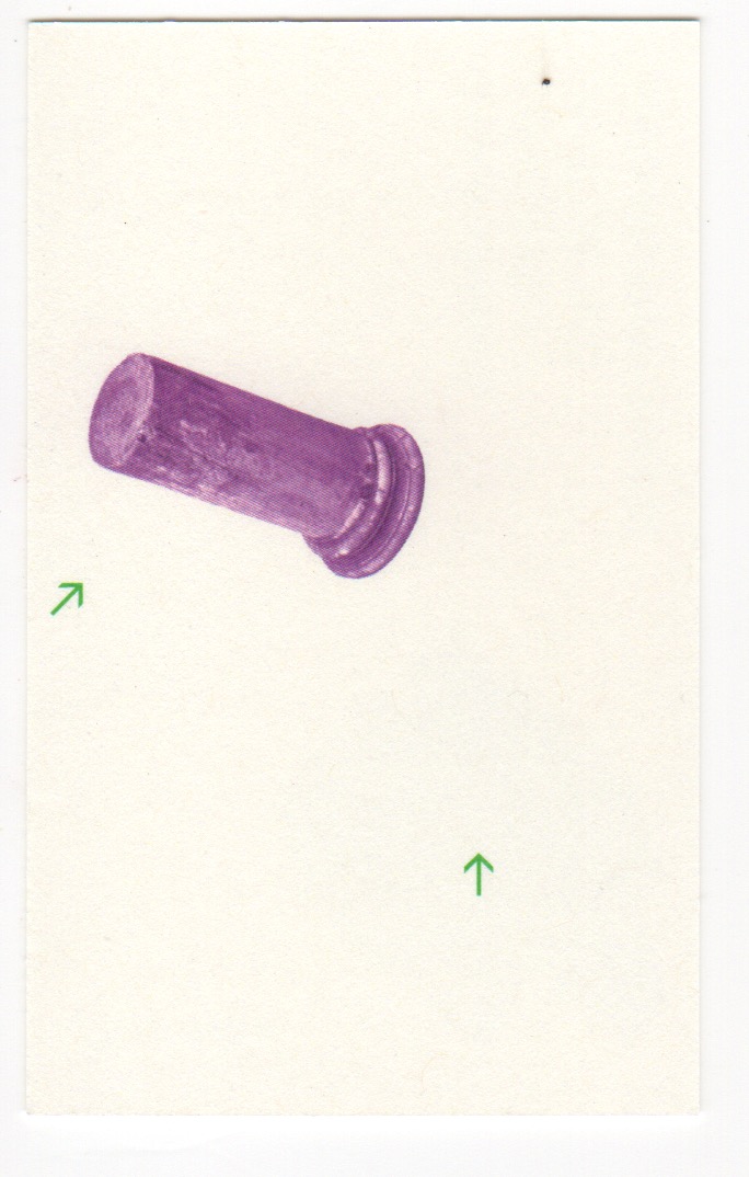
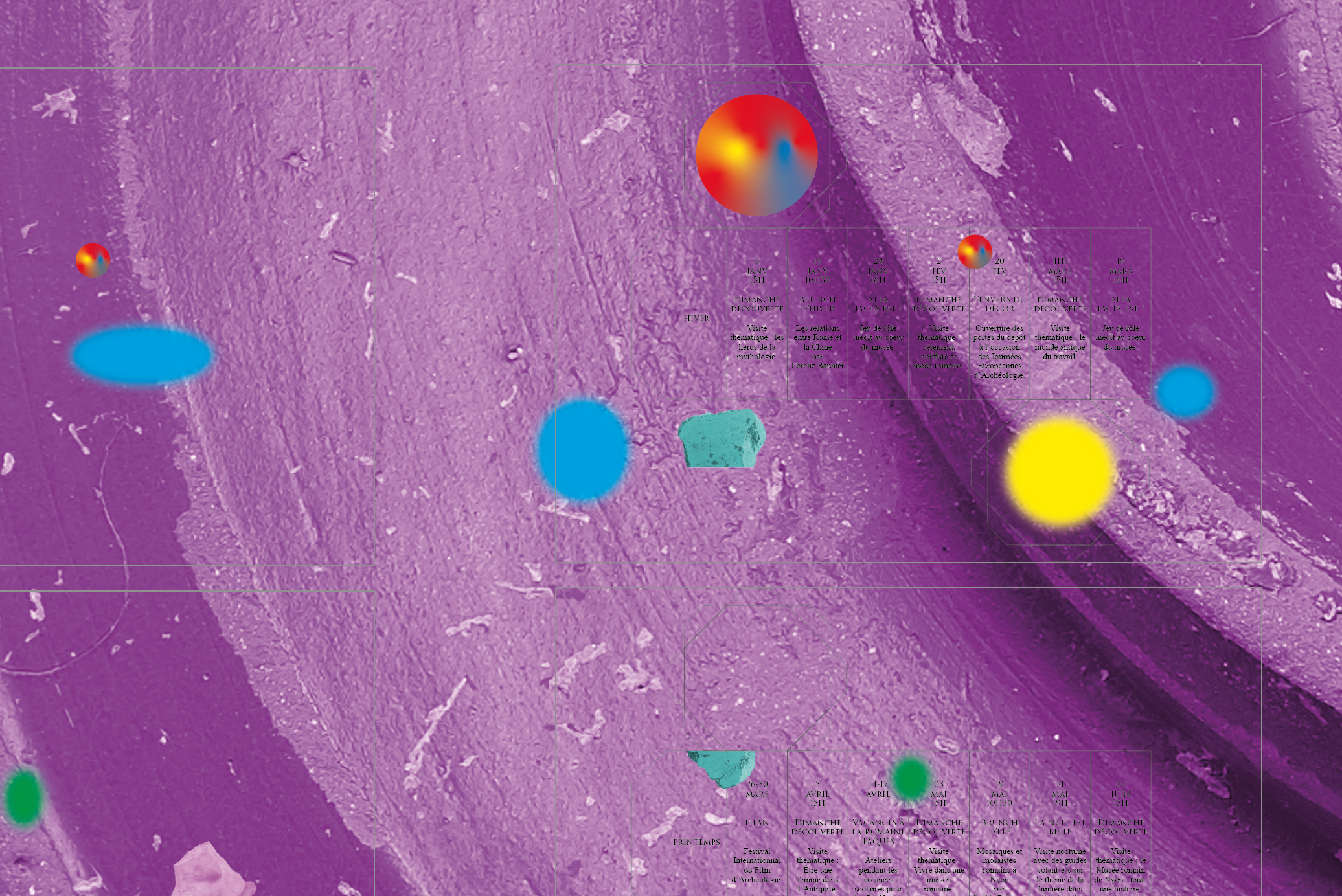
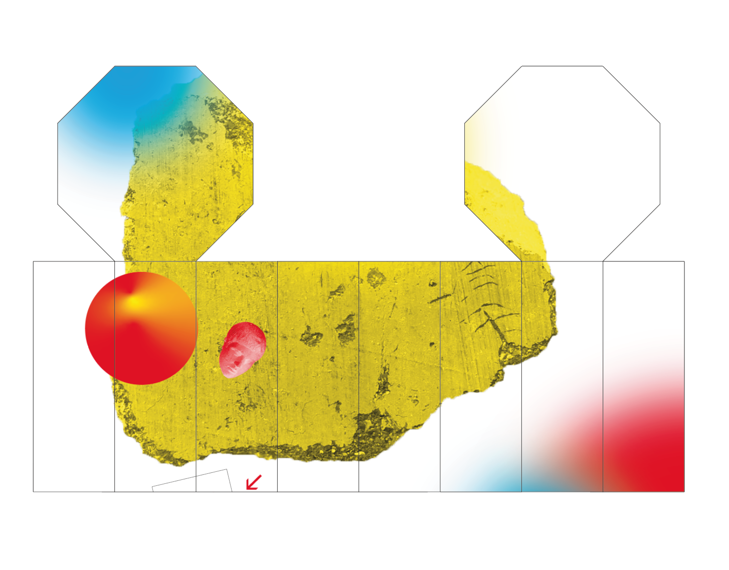
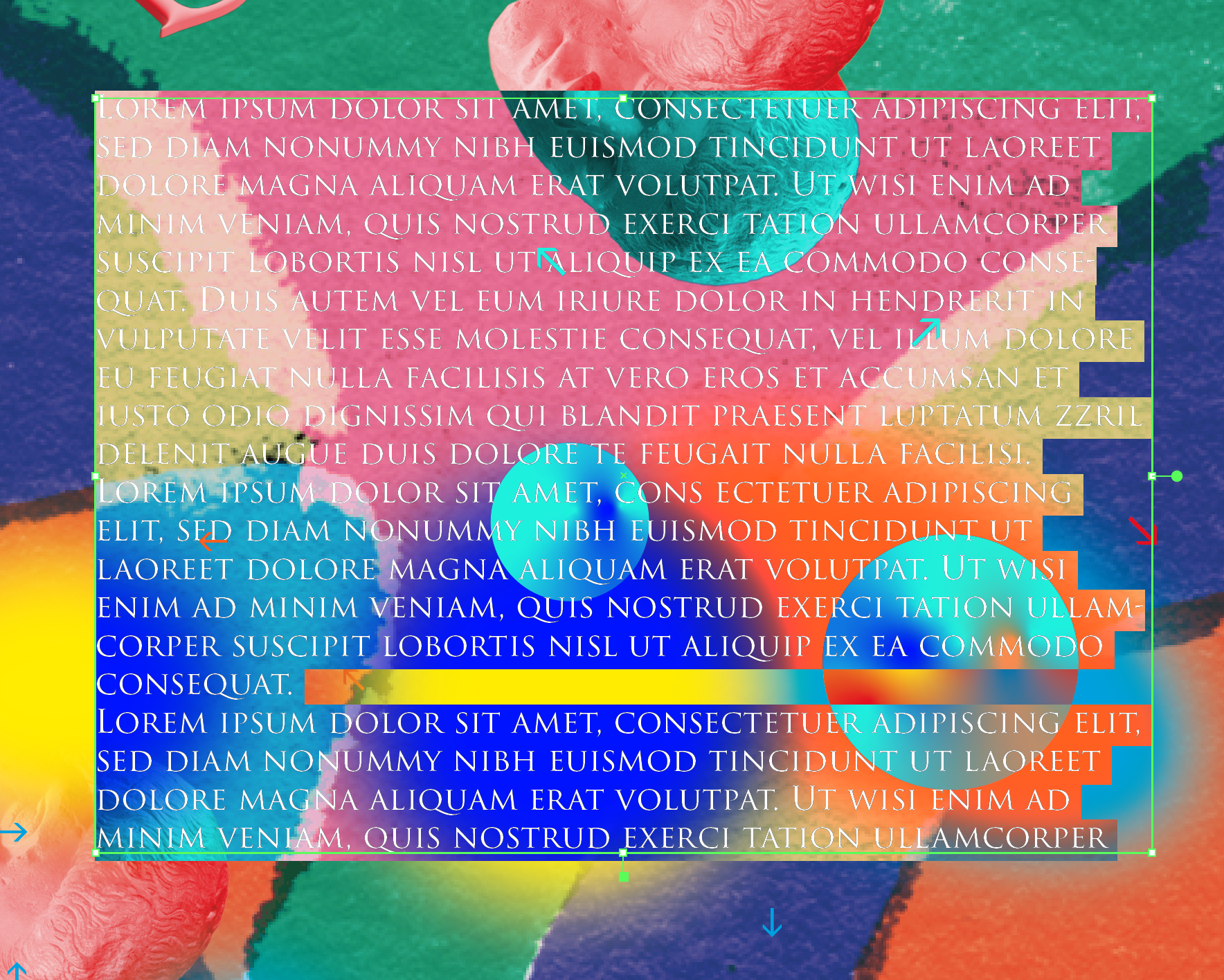
Thus, not taking themselves too seriously, the title text and the logotype also take their reference from the popular WordArt text effects in Windows 95. The objects are like coloured plastic copies or cheap toys. The logo of the museum, those of the various partners, and the paragraphs of the text appear in several colours on each support. The annual programme of activities is a do-it-yourself paper construction set in the form of an ancient column like those in the cryptoportico of the Roman forum in Nyon.
This identity is intended to be malleable to adapt to the museum's activities. Thus, the primary and secondary colours (blues, greens, reds, magentas and violets) are not a strict palette, but rather an open set of hues and the compositions are free and irregular associations of objects. Archéobjet does not constitute a strict graphic charter, but rather a base that takes shape over time and over the messages sent out by the museum.











︎︎︎ Applied system
















︎︎︎ Research
︎︎︎ Setup